5 Combined Company Data
5.1 Combined Company Stock Visualization
After collecting the stock price data from the companies, we combined them into two plots, following the same method as our Twitter visualization above. The first plot represents the stock prices for the companies compared against each other, while the second plot signifies the rate of change amongst the companies in terms of their stock price. Both of the plots are fairly linear and show consistently steady movement. This overall trend displays each company’s stock as being relatively stable.
ggplot( companystock, aes(x = StockDate,y= Price)) +
  geom_line(aes( color= Company), lty = 1, size = 2) +
  geom_hline(yintercept = 0, size = 1, color="#333333") +
    theme(legend.title=element_blank())+
  labs(title="Combined Company Stock Data", x= "Date", y= "Price of Stock ($)")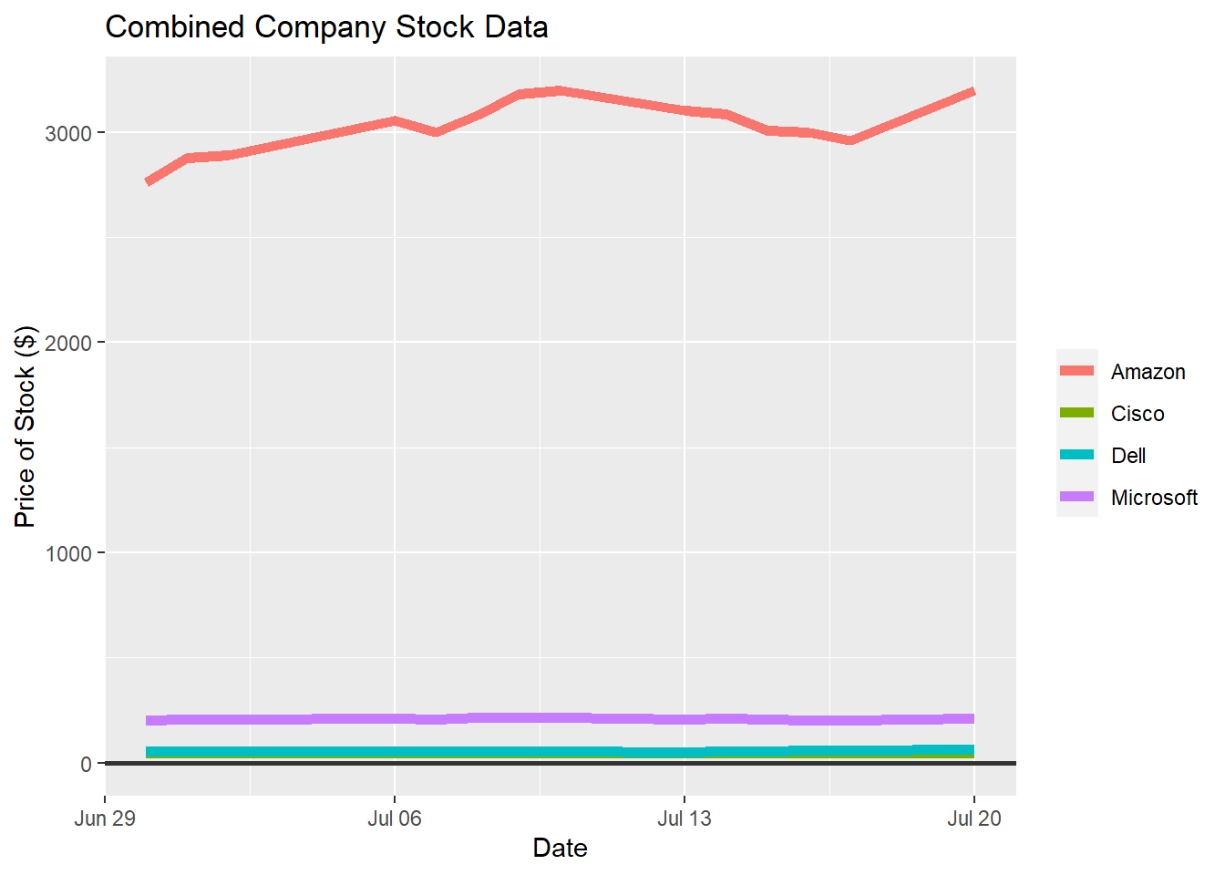
ggplot( companystock, aes(x = StockDate,y= scale(Price))) +
  geom_line(aes( color= Company), lty = 1, size = 2) +
  geom_hline(yintercept = 0, size = 1, color="#333333") +
    theme(legend.title=element_blank())+
  labs(title="Combined Company Stock Data", x= "Date", y= "Rate of Change")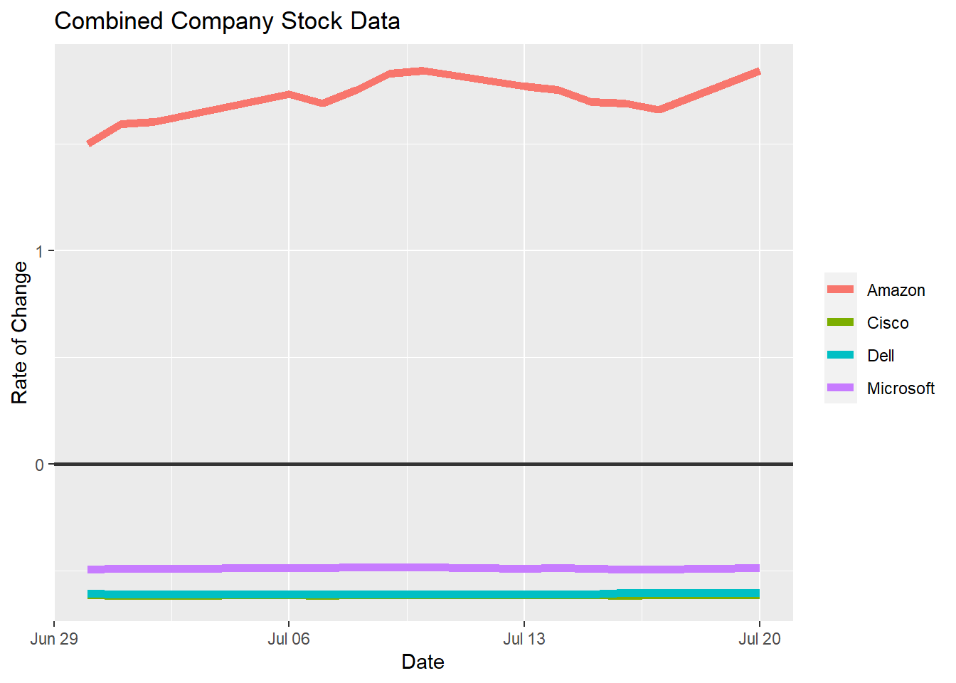
5.2 Combined Company Twitter Visualization
After we extracted the Twitter data from the four companies, we combined the data into two different plots. The first plot shows companies compared against one another based on the number of tweets per day. After that, we scaled the data to represent the rate of change against each other in the second plot. The results of both plots show an interesting relationship: the two plots look almost identical despite the second plot being based on the rate of change. This shows that even though Amazon had a significantly higher amount of tweets per day, they also experienced a significant rate of change during our twitter collection period.
ggplot(new_all_data, aes(x = New_Date,y= Company_Date)) +
  geom_line(aes( color= CompanyName), lty = 1, size = 2) +
  geom_hline(yintercept = 0, size = 1, color="#333333") +
  xlim(x= c(Sys.Date()-23, NA))+
    theme(legend.title=element_blank())+
  labs(title="Combined Company Twitter Data", x="Date", y="Number of Tweets")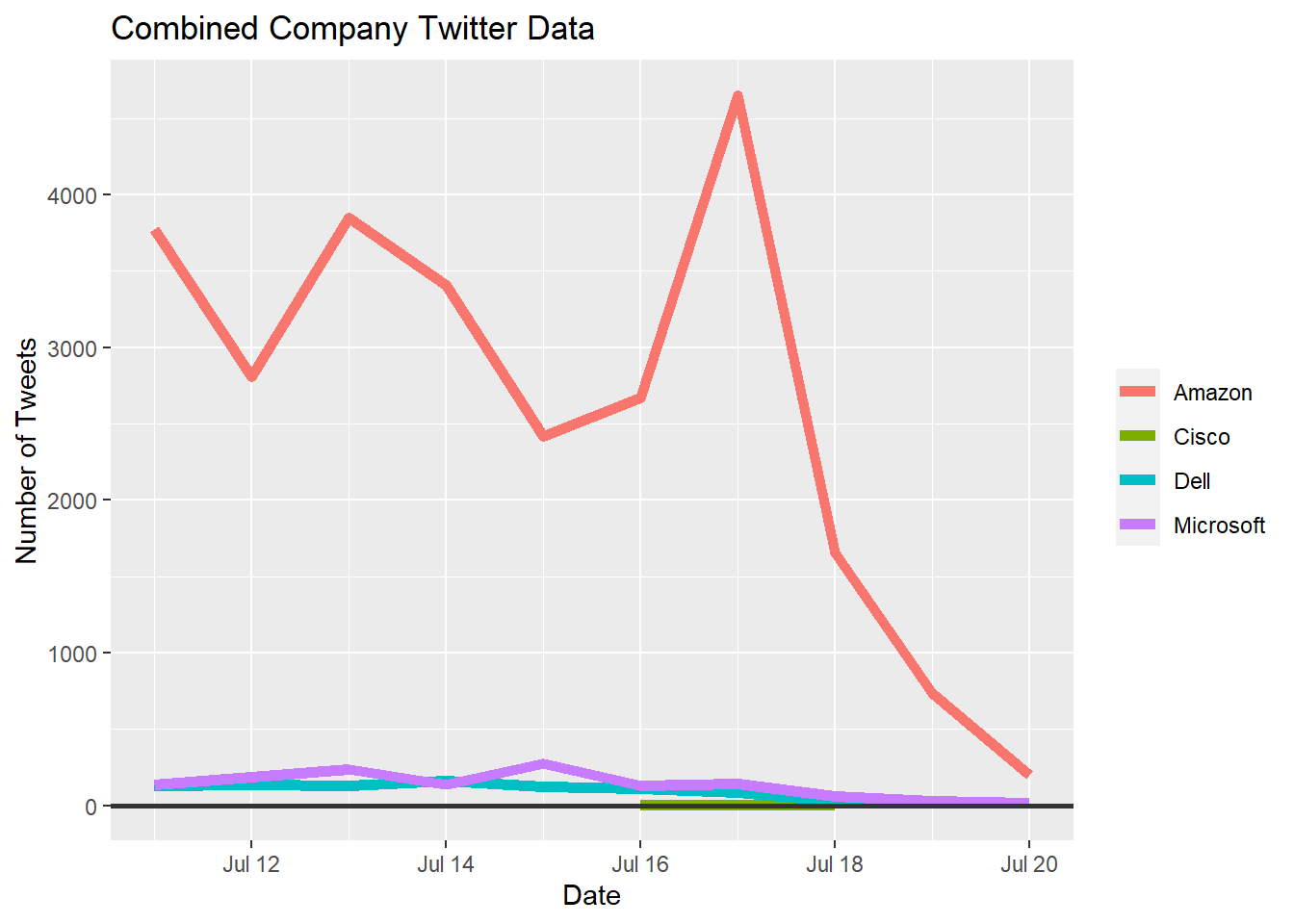
ggplot(new_all_data, aes(x = New_Date,y= scale(Company_Date))) +
  geom_line(aes( color= CompanyName), lty = 1, size = 2) +
  geom_hline(yintercept = 0, size = 1, color="#333333") +
  xlim(x= c(Sys.Date()-23, NA))+
    theme(legend.title=element_blank())+
  labs(title="Combined Company Twitter Data", x="Date", y="Rate of Change")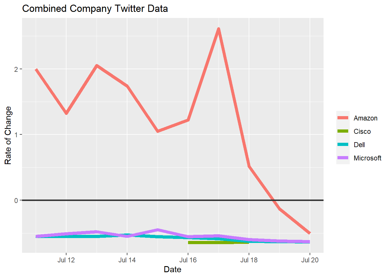
5.2.1 Information Worth Noting
The only real section of volatility is shown towards the end of the second plot with the Amazon trend. Towards the end of the term, we collected data for you to see a small dip. This makes sense considering the drastic change we saw in the tweet data for Amazon, but still doesn’t match the trend entirely. While there is no full explanation of Amazon’s trends not completely matching up, there have been previous accusations of “FC Ambassadors” putting up positive experiences about Amazon on social media. This amount of production these ambassadors cause has been criticized and possibly even reduced as of lately, explaining possible declines in Twitter activity. Further details can be accessed through the following article, “Amazon Uses Twitter Army of Employees to Fight Criticism of Warehouses”, by the New York Times (Jonah Bromwich, 2019).